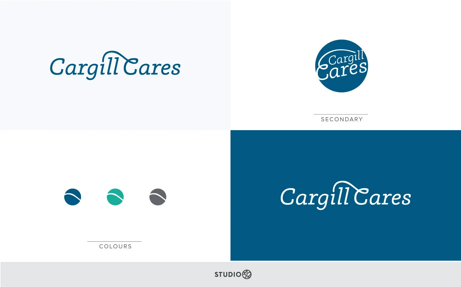
Cargill Cares | LOGO DESIGN
The Cargill Cares Logo was developed to help support internal incentives to do good work for communities. Cargill's corportate logo uses a leaf to jump from the "a" to the dot of the "i", so in this logo, I used this inspiration to dot the "i" in Cargill. This time the dot comes from the swoosh in the capital "C" of cares, signifying an act of kindness and caring as the letterforms work together.
Small button graphics were created to complete the branding for materials that would need a smaller version of their logo.
Client: Cargill


