
Physiotherapy Branding


As cannabis becomes more popular, the demographics of people using cannabis increases so important for the brand for Fireweed to be a brand that feels accessible to all.
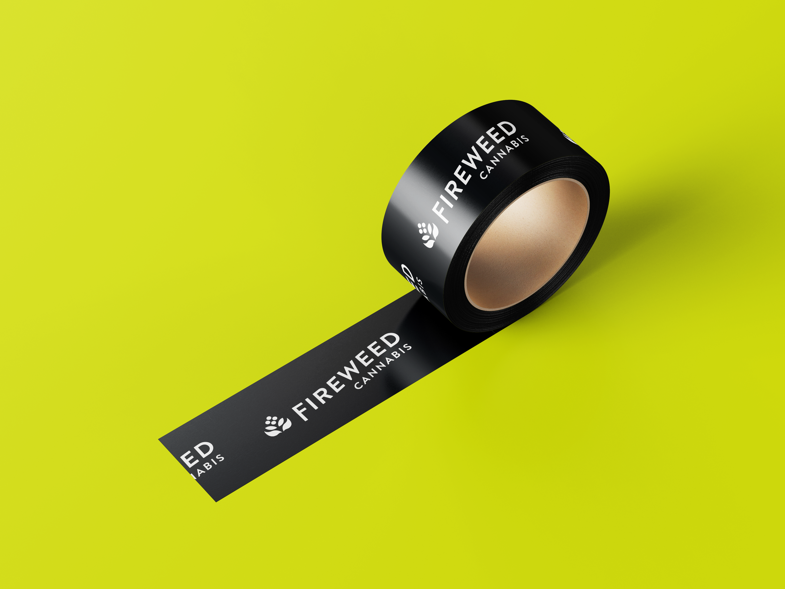
A strong wordmark has been created for the Fireweed Cannabis brand to create a classic, timeless look. The main logo, with itʼs uplifting layout, creates a brand that is approachable and friendly.
The icon that accompanies the wordmark is a simplification of the fireweed plant, but with flame-style leaves as the bottom. By creating a logo with an impactful icon, the branding uses become endless. Clients of Fireweed Cannabis will be able to spot the icon or the logo and know that they are getting friendly, uplifting and natural products.
The town of Churchill is steeped in bold nature and a strong community and the new Fireweed Cannabis brand folds into that culture seemlessly.
Client: Fireweed Cannabis - Churchill