
Village Vixens | Logo + Branding

The Village Vixens are bright, independent women pooling together their talents and skills to better their community one event at a time. For their inaugural charity event, they needed a logo and branding system that could grow with their group, be flexible as the needs of their organization changed, and create an energetic and inviting image for their first women’s only event.
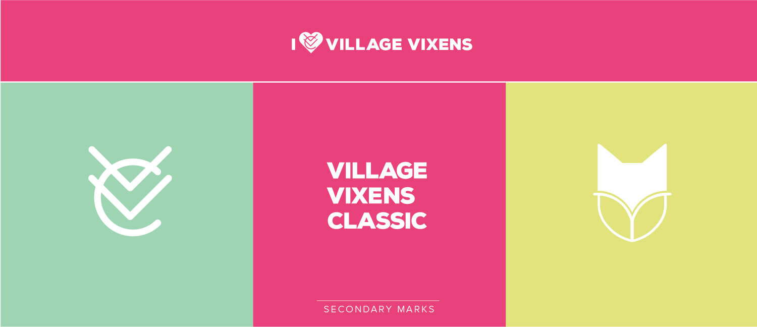
The logo is based on a fox face (vixen) and is build in the shape of a shield. The four quadrants of the shield house the elements of the golf course as well as camp images (trees, stars and lake) which was the Vixens first charity beneficiary. Supporting graphics were created with these elements to create a cohesive branding experience.
Client: Village Vixens